Introduction
Founded in 2018 by a trio of passionate technology enthusiasts and former colleagues, Network Right has established itself as a leading IT company dedicated to providing cutting-edge IT solutions to organizations. With a firm belief in the power of technology and the value of human connections, we have worked to become a one-stop shop for all your technology needs.

At Network Right, our primary goal is to simplify the way companies collaborate with us and foster mutual growth. As our clients thrive and grow, so do we. With this in mind, we are excited to announce our rebranding initiative, which aims to communicate our transformation, partnerships, and offerings to the market.
We are thrilled to reveal our revitalized visual identity, meticulously crafted to capture the essence of our brand…

Purpose
The rebranding extends beyond graphical aesthetics. We aimed to embody our company’s mission, vision, and values, which serve as the company’s foundation. We asked ourselves important questions: How can we elevate our logo to reflect our identity clearly? How can we convey a solution-oriented approach? How can we align our brand messaging with our visual representation?
With these questions in mind, we sought out a partner who would help us find the answers and give our brand the voice it needed. We found a perfect match in the creative team over at BrandZap. Like many of the companies we cater to, the need for efficiency and agility was at the forefront of our branding journey. Thanks to our collaboration with BrandZap, we were able to revitalize our graphic identity from the ground up, achieving this transformation in just a few weeks.
Throughout the rebranding journey and exercises, we considered several directions: bold and action-oriented, calm and reliable, or relaxed and emotive. We ultimately chose to emphasize calmness and reliability. At Network Right, we pride ourselves on being a resource for one another, and one of our core values “People first, IT as a conduit” reflects this commitment.
When something goes wrong with your computer or application, it is instinctual to reach out to IT. This is when Network Right steps in to help understand and address the problems at hand. Our approach to IT is to instill a sense of calmness and be that breath of fresh air for clients seeking solutions. Our new visual identity elicits this tranquil feeling and in parallel, our communication style remains dependable, empathetic, and reassuring. We position ourselves as a source of stability amidst challenges, aiming to instill confidence in our clients and make them feel understood and supported, even in the most demanding circumstances.
The New and Improved
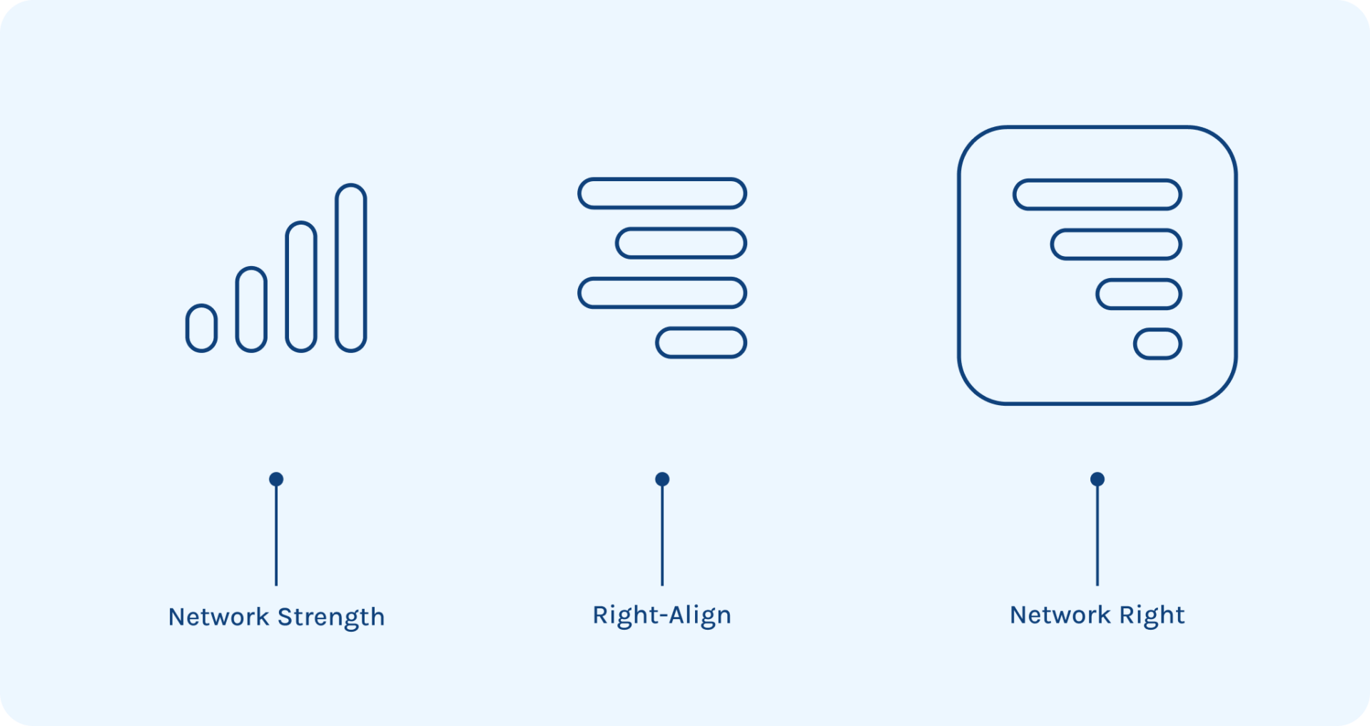
Introducing Network Right’s refreshed graphic identity, meticulously designed to resonate with the essence of our brand and the values we uphold. At the heart of our new look is our innovative logo, which elegantly combines two universally recognized symbols: network strength bars and a right-alignment UI icon. The resulting design is as intuitive as it is aesthetically pleasing. A full network bar symbolizes our strong connection and dedication to supporting our clients.

Our refreshed color palette, featuring serene shades of light blues and greens, is intended to foster trust and guide our customers. Likewise, our newly adopted font family, IBM Plex Sans, pays homage to the bedrock of enterprise computing, offering a subtle nod to our developer and IT community.
More than just a flat design, our new brand identity is conceived as a spatial environment. It’s a canvas made up of a foreground, background, and crucially, the space that bridges the two. Floating between the content and background, you’ll find our brand’s signature color blooms. These are a graphic embodiment of our service offerings and client interface: active, innovative, intelligent, actionable, and efficient. These blooms signify our willingness to adapt to our client’s environment. While similar in nature, each bloom is unique; a reflection of the custom nature of our clients needs and the intricate solutions we provide.
Most critically however, these blooms never occupy the foreground. Like the tools we use to enable our clients productivity, connectivity, and security, these graphic representations exist behind the humans of Network Right, the core bedrock of our brand.

Conclusion
At Network Right, being your go-to IT partner is not just a tagline; it’s our unwavering commitment to our people, our clients, and our partners. Our new brand identity best represents who we are and propel us forward as an organization. We aim to provide a consistent experience for our current and future clients in every interaction.
As we embark on this exciting rebranding journey, we hope you find us to be your go-to IT partner now, and for years to come.


